"A picture is worth a thousand words" – I finally understood this phrase in my third year of entrepreneurship, but it came at a cost.
The Night That Changed Everything
I remember that late night in 2022, staring at Instagram posts with tens of thousands of likes, feeling a mix of frustration and determination. Why were similar products getting thousands of likes while mine barely reached double digits?
That night, I spent six hours analyzing what made viral posts successful. The result shocked me: 90% of viral content shared one common characteristic – perfect visual presentation.
My Visual Strategy Evolution Journey
Phase 1: The Blind Follower Era (Early 2022)
Back then, I was a complete visual novice. I copied whatever was trending, with predictable results – content with no personality that users couldn't remember.
Mistakes I Made:
- • Blindly using trending filters, creating brand confusion
- • Inconsistent image sizes, looking unprofessional
- • Random text layouts with poor readability
Phase 2: The Awakening (Mid 2022)
I started systematically learning visual design, spending a month studying major brands' visual strategies.
Key Discoveries:
- • Consistency beats perfection: Even simple designs build brand recognition when consistent
- • Size standardization: Each platform has optimal dimensions
- • Color psychology: Different colors trigger different emotional responses
Phase 3: Tool Empowerment (Late 2022)
This phase marked a turning point when I started using professional image processing tools, dramatically improving both efficiency and quality.
My Tool Arsenal:
- • SocialCrop: For quick image resizing across all major social platforms
- • Canva: For template creation and text addition
- • Lightroom: For color correction and basic editing
Phase 4: Data-Driven Era (2023-2025)
Now, every visual decision I make is backed by data analysis.
My Data Tracking System:
- • Click-through rate comparisons for different image sizes
- • Interaction rate analysis for different color combinations
- • Conversion rate statistics for different layout styles
Real-World Experience Sharing
1. Instagram Post Golden Rules
After testing 500+ posts, I discovered Instagram's best practices:
Size Requirements:
- • Square posts: 1080x1080px
- • Landscape posts: 1080x566px
- • Portrait posts: 1080x1350px
Visual Elements:
- • Maximum 3 primary colors
- • 30-40% white space ratio
- • Text size ensuring mobile readability
2. WeChat Moments Visual Strategy
WeChat Moments has unique visual characteristics:
Best Practices:
- • Image size: 1080x1080px or 1080x1350px
- • Avoid overly commercial designs
- • Add lifestyle elements to increase relatability
3. Xiaohongshu Content Visualization
Xiaohongshu users have extremely high visual standards:
Key Elements:
- • Cover images must be eye-catching
- • Color saturation can be appropriately increased
- • Text layout must be clear and readable
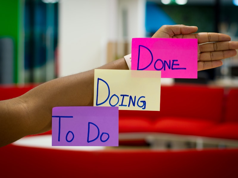
My Visual Content Creation Workflow
Step 1: Content Planning
Every Sunday evening, I plan the week's visual content:
- • Determine themes and tone
- • Select primary and secondary colors
- • Design unified visual elements
Step 2: Material Preparation
- • Shoot or collect high-quality images
- • Prepare brand fonts and logos
- • Organize commonly used design elements
Step 3: Batch Production
Using tools like SocialCrop, I create all platform versions at once:
- • Adjust to each platform's optimal size
- • Maintain visual consistency
- • Optimize loading speed
Step 4: Data Tracking
After publishing, I record data at 24 hours, 72 hours, and one week:
- • Likes, comments, shares
- • Click-through and conversion rates
- • User feedback and interaction quality
Moments That Changed My Perspective
Moment 1: First Time Using Standardized Sizes
I remember the first time I strictly followed Instagram's 1080x1080px size. That post's interaction rate increased by 40% compared to previous posts. In that moment, I realized: professionalism isn't about complexity, it's about precision.
Moment 2: Discovering the Power of Color
When I started using consistent brand colors, users began actively recognizing my content. A fan messaged me saying: "I know it's you when I see this color!" That's when I truly understood the power of brand visuals.
Moment 3: Data-Driven Surprises
Through data analysis, I discovered that landscape images had 15% higher click-through rates than square images. This finding made me rethink my content strategy and strengthened my belief in data-driven decisions.
Advice for Newcomers
1. Start with Imitation, But Add Your Own Flair
Don't be afraid to imitate excellent work, but always add your own elements. I recommend newcomers:
- • Choose 3-5 favorite accounts as references
- • Analyze their visual styles and design elements
- • Add your own brand characteristics on this foundation
2. Tools Aren't Everything, But Good Tools Make a Difference
I recommend several practical tools:
- • SocialCrop: Professional social media image resizing tool
- • Canva: Beginner-friendly online design platform
- • Unsplash: High-quality free image library
3. Maintain a Learning Mindset
Visual design is an ever-evolving field with constantly emerging trends and tools. I recommend:
- • Learn at least one new design technique monthly
- • Follow industry influencers' updates
- • Participate in relevant online courses or workshops
Final Thoughts
From visual novice to current "semi-professional" level, it took me exactly two years. This process was challenging but immensely rewarding.
Most importantly, I learned to communicate with users through visual language.
Now, whenever I see users benefiting from my content, I feel all the effort was worthwhile.
If you're also struggling with social media visual content, remember: a good start is half the battle, and persistence is everything.
About the Author
Sarah Chen is an entrepreneur who has been navigating social media marketing for 3 years. If you found this article helpful, follow her account for more practical experience sharing.